My Role
UX/UI designer.
Responsabilities
Conducting interviews, papers and digital wire framing, low and high-fidelity prototyping, conducting usability studies, accounting for accessibility, and iterating on designs.
Project duration
August, 2024 to October, 2024
Project Overview
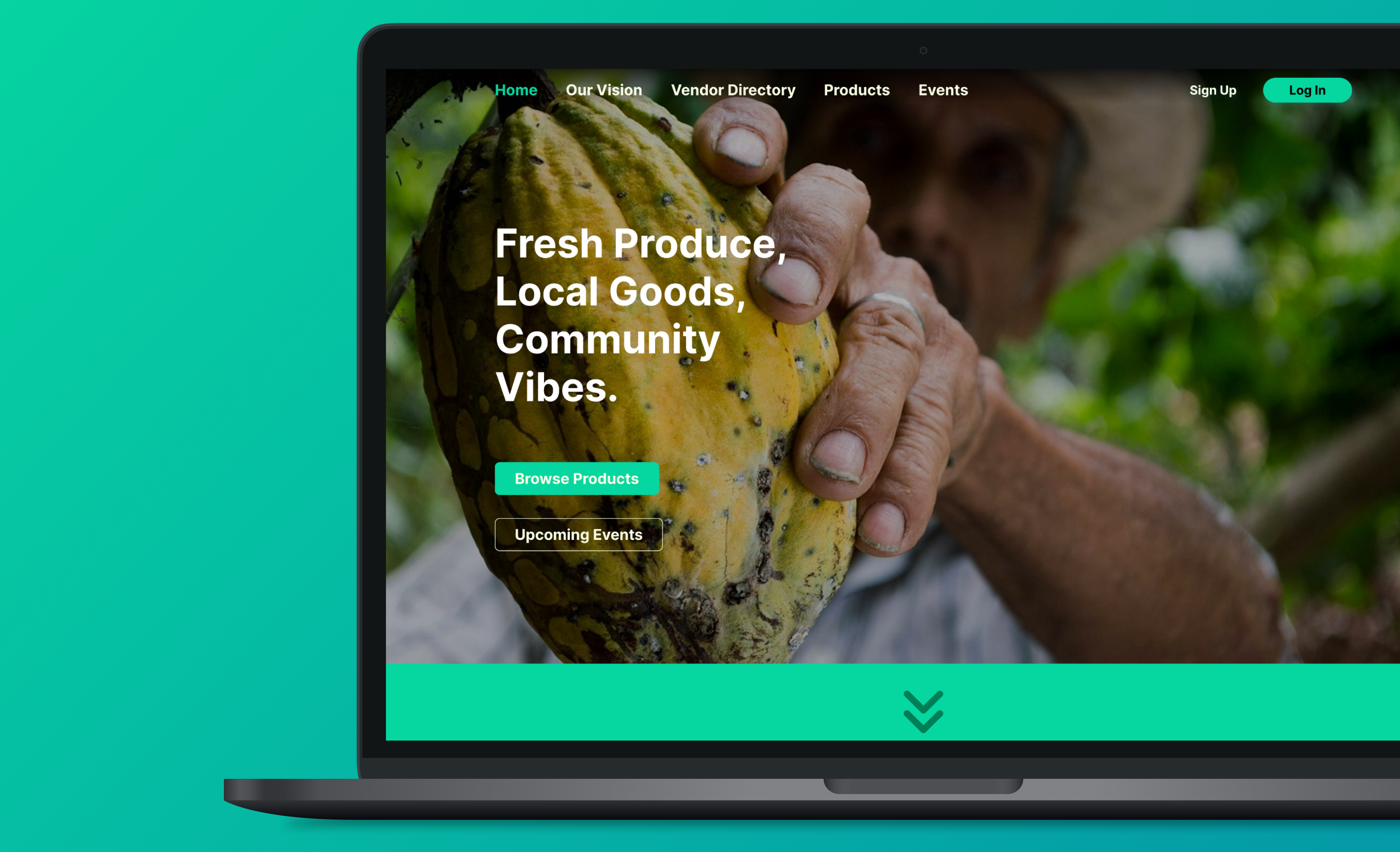
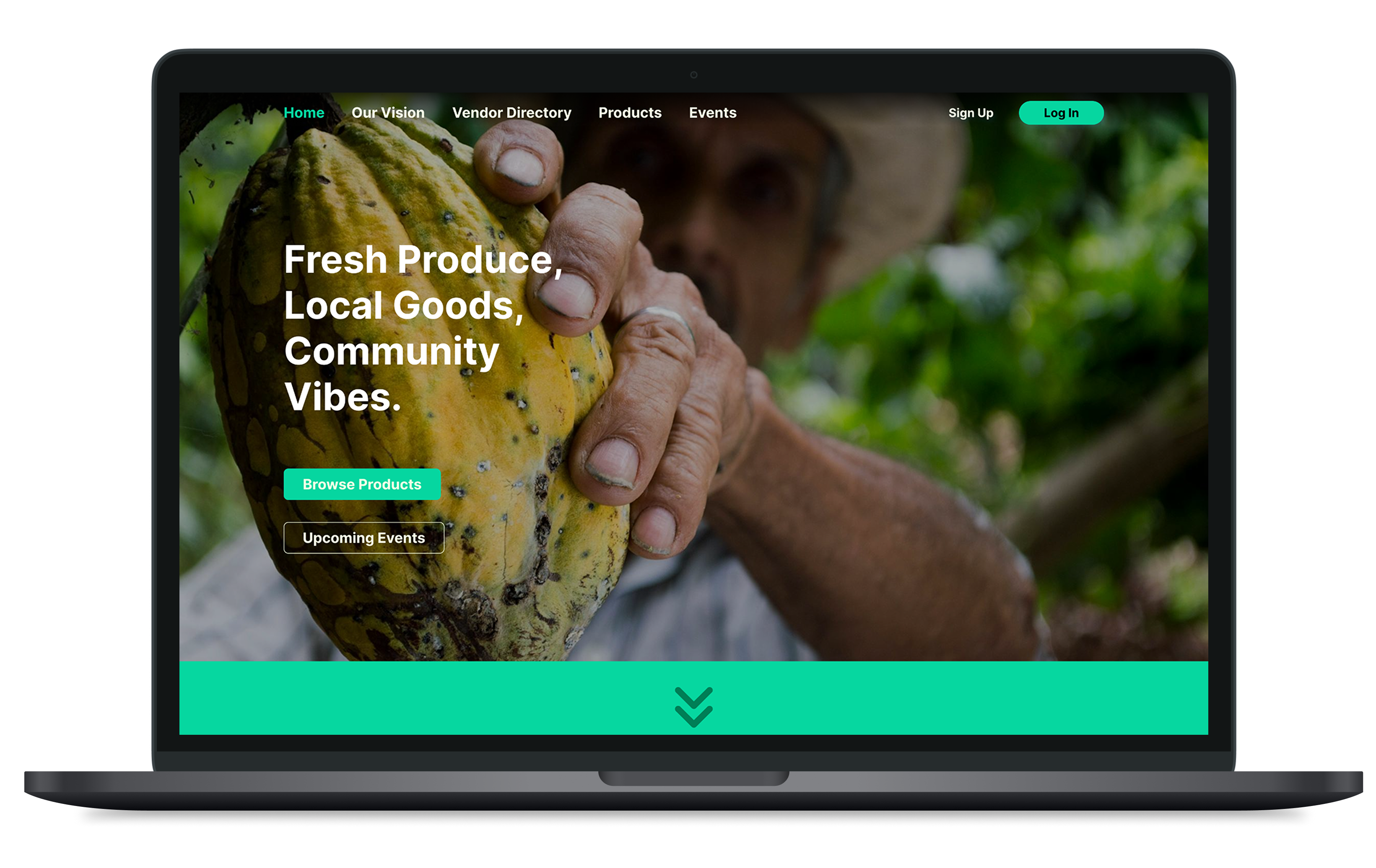
Farm2Table is an online platform designed to connect consumers directly with local farmers. It allows users to browse fresh produce, order directly from farmers, and track deliveries, promoting healthier, sustainable food choices while supporting local agriculture.
The Problem to Solve
Farmers markets and local food producers often lack the infrastructure to easily sell their goods online, limiting their reach and revenue potential. Consumers also face difficulties finding fresh, local produce outside of traditional farmers’ markets, especially those who are busy or do not have access to physical markets.
How We Could Solve It
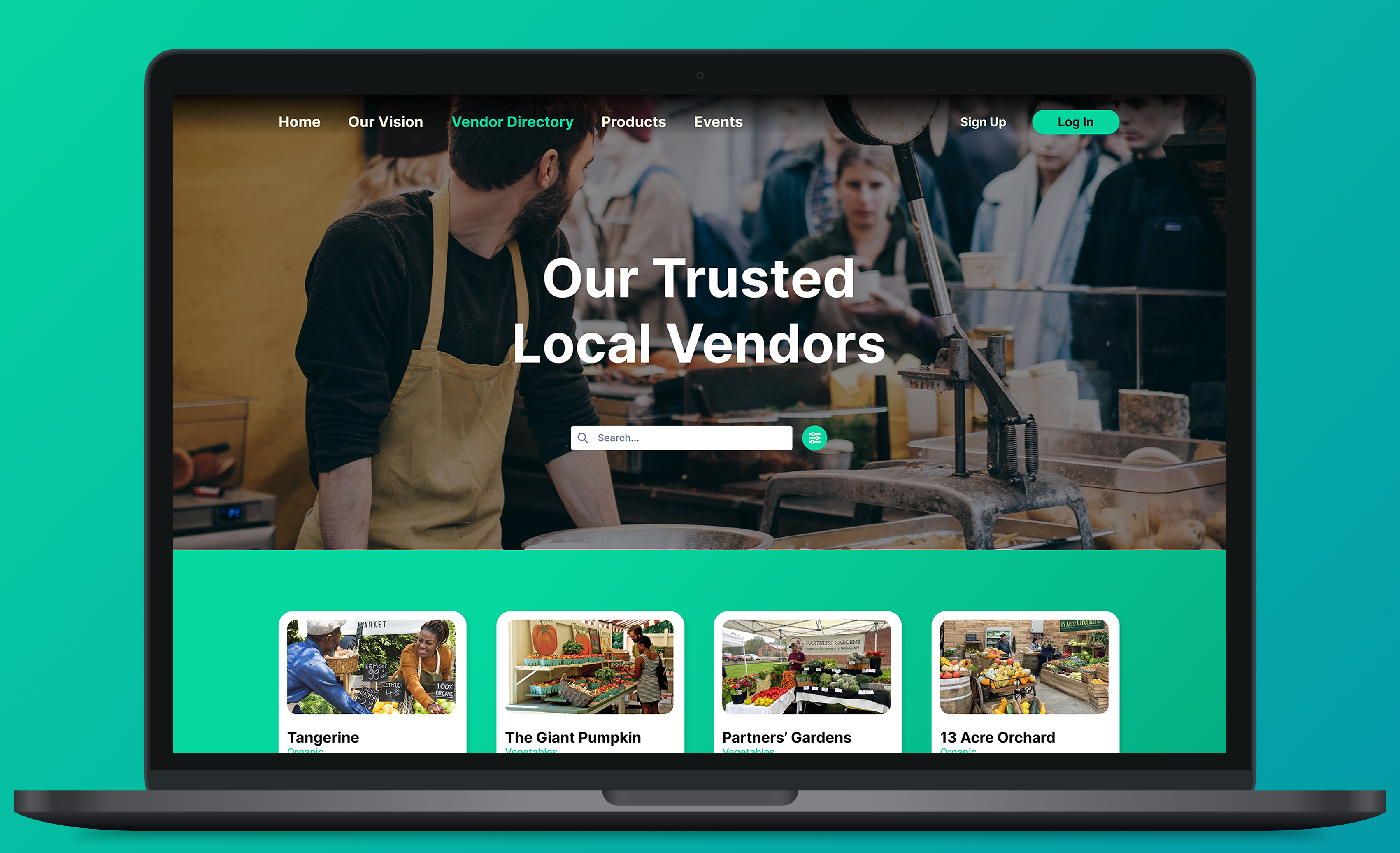
We developed a user-friendly website where users could easily browse fresh produce, learn about the farmers, and place orders online. By integrating features like search filters for dietary preferences, delivery tracking, and community feedback on products, we aimed to create an engaging and efficient shopping experience that brought local food to the digital age.

Research Methods:
• User Interviews: Interviewed local farmers and consumers to understand their needs for an online marketplace.
• Market Analysis: Researched competitors and existing platforms to evaluate the viability of a digital marketplace for local produce.
• Usability Testing: Tested the platform with real users, gathering feedback on ease of navigation, product search, and checkout processes.
Interview Insights:
• Farmers struggled with logistics and delivery management when selling online.
• Consumers preferred to buy fresh, local food but often didn’t have time to visit farmers’ markets in person.
• Many users were unsure about the quality and sourcing of online produce.
User Personas
• Lily, 40: A busy professional who wants access to fresh, organic produce but doesn’t have the time to visit a physical market.
• James, 52: A local farmer who is interested in reaching a broader market but lacks the technical know-how to sell online.
Key Motivators
• Convenience: Providing an easy, efficient shopping experience for users.
• Transparency: Ensuring that consumers could trust the origin of their food.
• Sustainability: Promoting eco-friendly farming practices and supporting local economies.
The Design
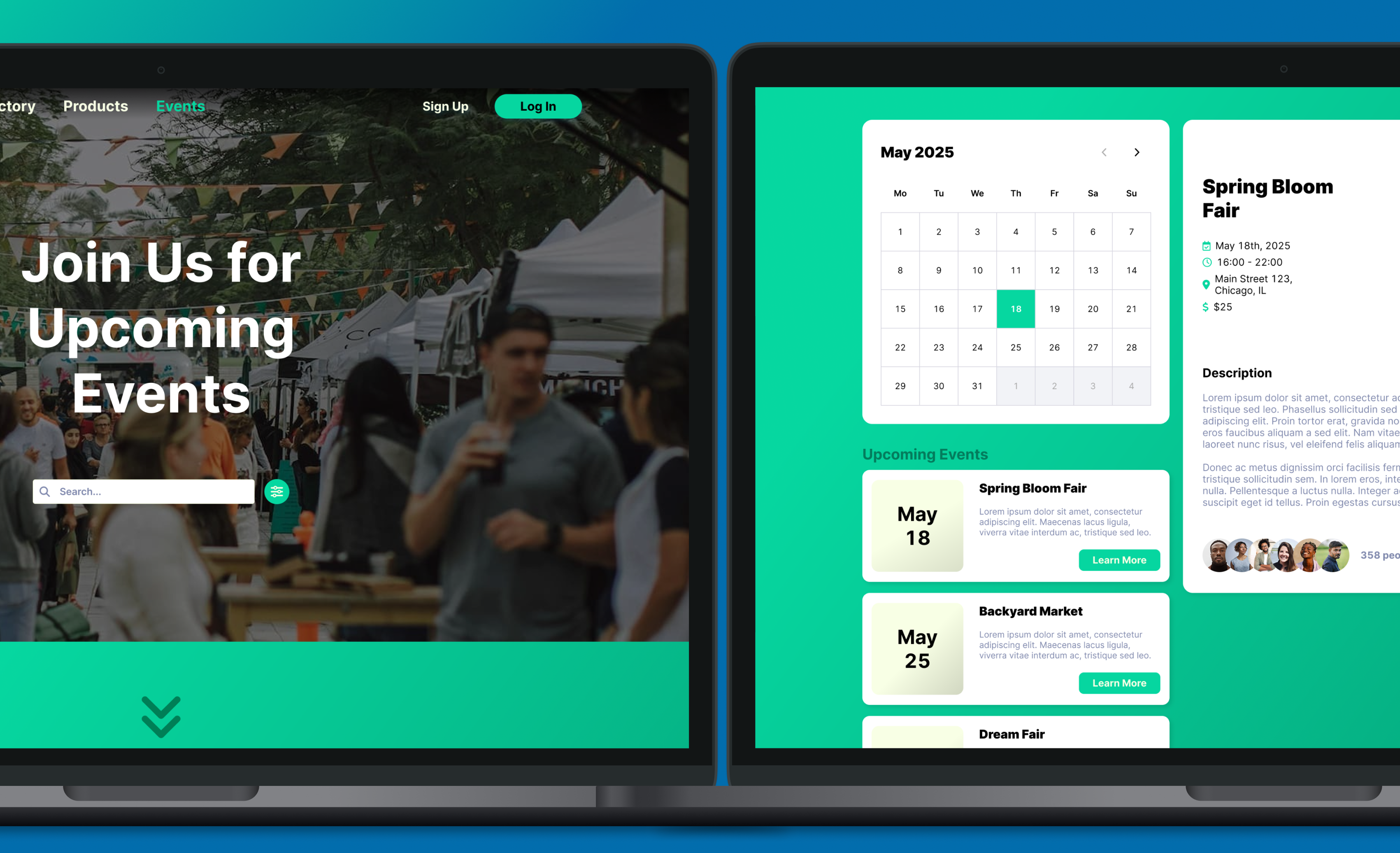
The design was built with simplicity in mind, ensuring that users could easily find and order products. The interface featured clear product information, farm origins, and availability, while also including features like delivery tracking.


The Result & Learning
Sales from local farmers increased by 30% in the first quarter after launch. We learned the value of educating users about product origins and the importance of straightforward navigation, especially when it comes to fresh food. Integration with delivery services proved to be a crucial element for success.
