My Role
UX/UI designer.
Responsabilities
Conducting interviews, papers and digital wire framing, low and high-fidelity prototyping, conducting usability studies, accounting for accessibility, and iterating on designs.
Project duration
October, 2024 to November, 2024
Project Overview
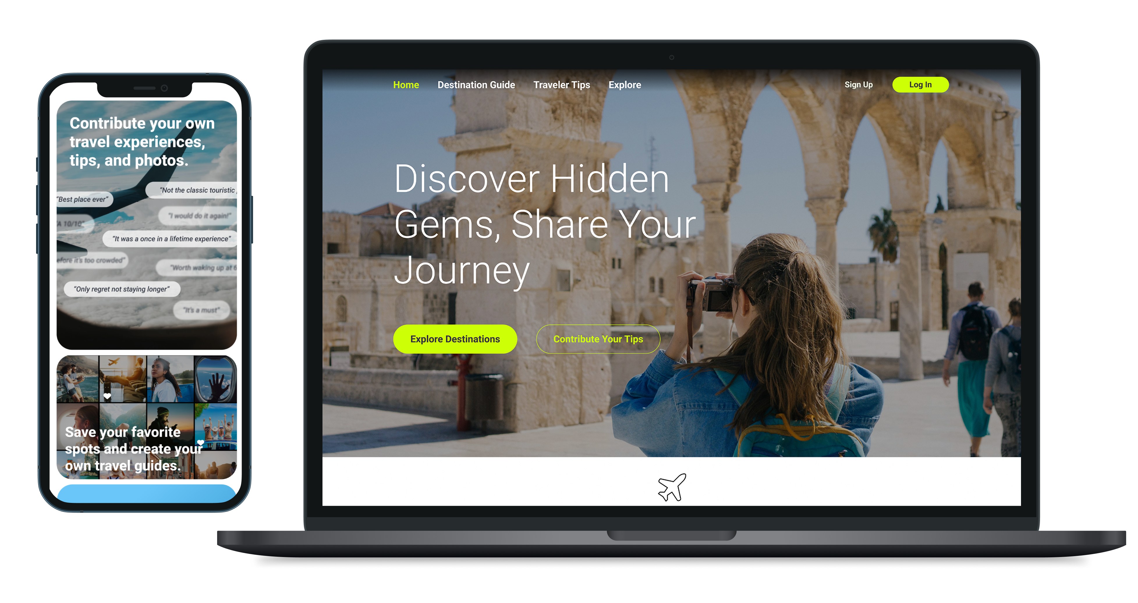
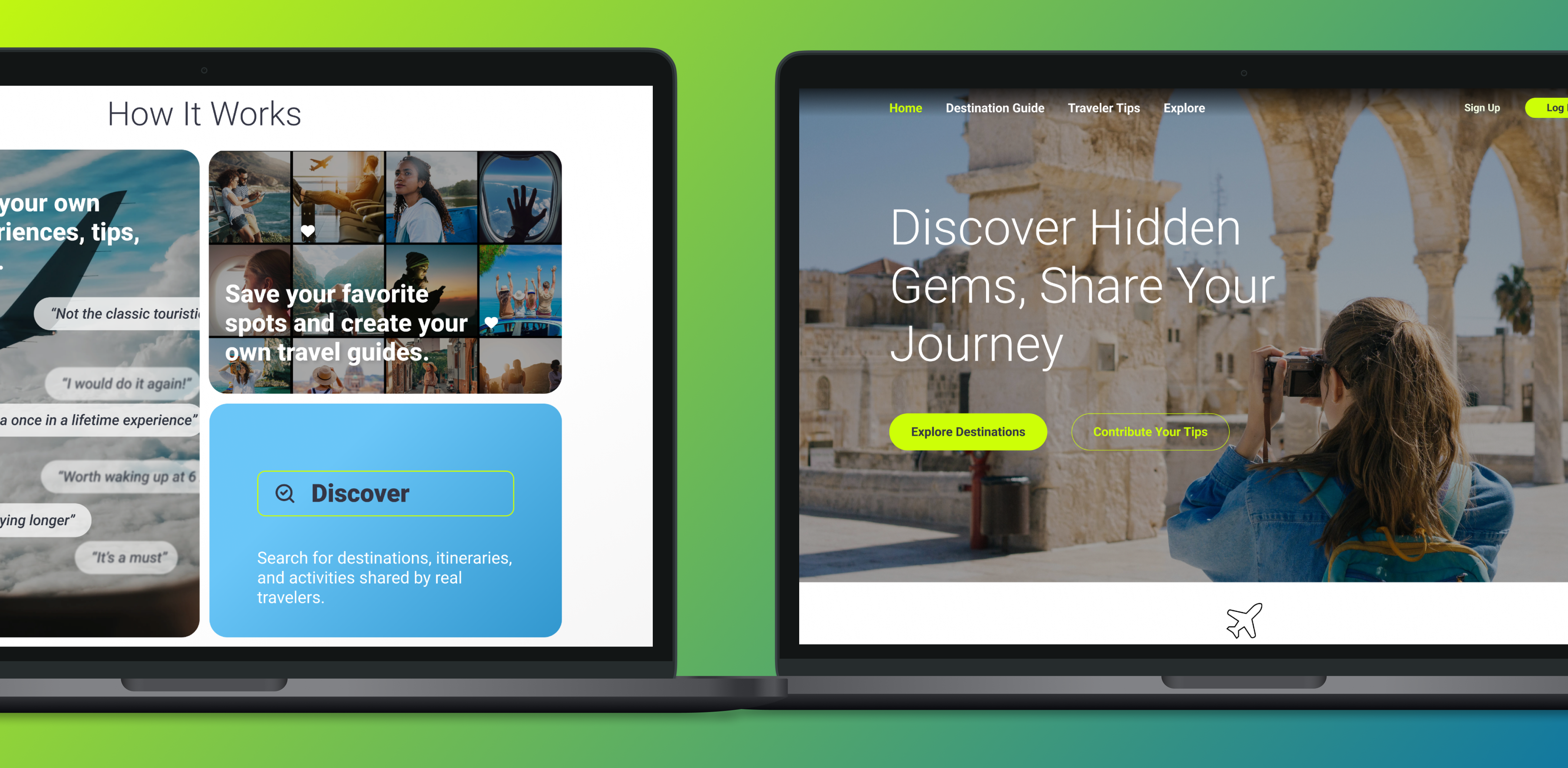
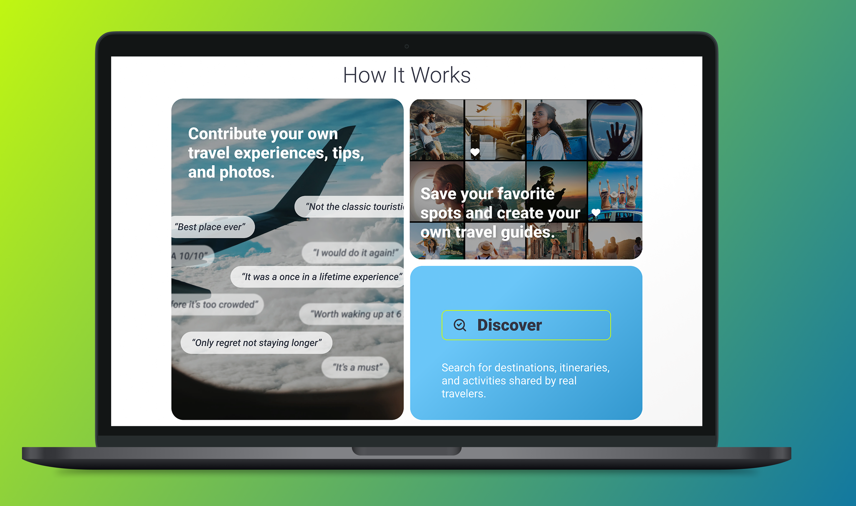
ExploreTogether is a crowdsourced travel guide platform where users can share personal travel tips, itineraries, and hidden gems with others. The platform allows travelers to discover unique experiences based on recommendations from fellow adventurers, making it easier to plan memorable trips.
The Problem to Solve
Travelers often rely on mainstream recommendations and generic guides, leading to overcrowded tourist spots and missing out on more authentic, off-the-beaten-path experiences. There was a need for a platform that could empower users to share their personal travel experiences, ensuring others could benefit from more diverse, personalized recommendations.
How We Could Solve It
By creating a user-centric platform where travelers could contribute tips, itineraries, and reviews, we enabled the discovery of lesser-known destinations. We focused on designing an intuitive, easy-to-use interface where travelers could quickly search for, share, and rate travel recommendations, fostering a community-driven experience that provided value to all users.
Research Methods:
• User Interviews: Conducted with frequent travelers to understand what features they valued in travel platforms.
• Competitive Analysis: Studied other travel platforms to identify gaps in crowdsourced travel content.
• Usability Testing: Tested the interface with a group of travelers to ensure easy navigation and information sharing.
Interview Insights
• Travelers wanted more personalized recommendations based on interests, rather than generic lists. • Many found traditional travel guides too focused on touristy spots, preferring hidden gems suggested by locals. • Community-driven features like reviews and ratings were highly valued.
User Personas
• Sophia, 29: An adventurous traveler looking for off-the-beaten-path experiences.
• David, 45: A family traveler who prefers detailed itineraries and family-friendly activity suggestions.
Key Motivators
• Authenticity: Providing real experiences and tips shared by other travelers.
• Personalization: Curating recommendations based on user interests.
• Community: Fostering a sense of collaboration and sharing.
The Design
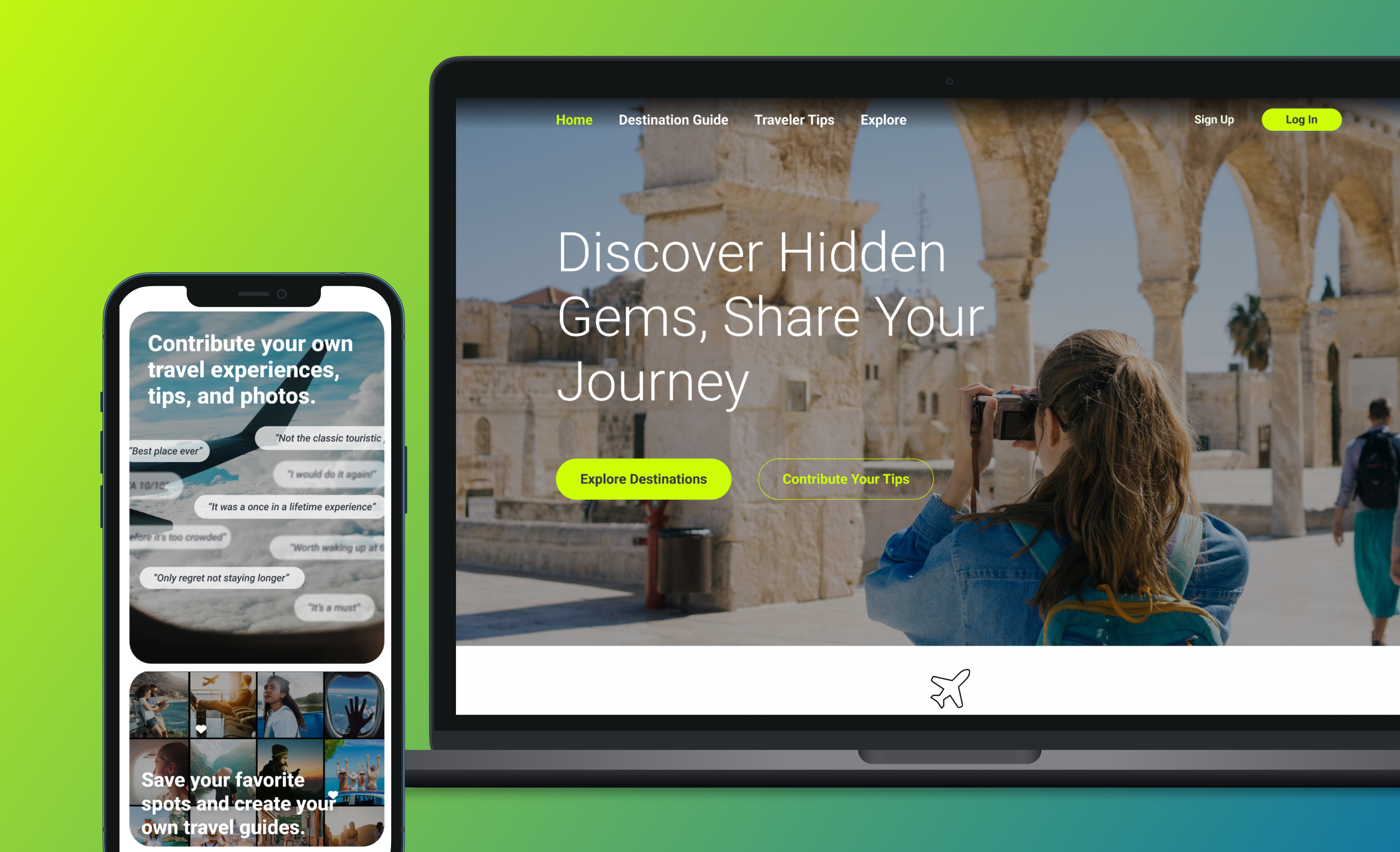
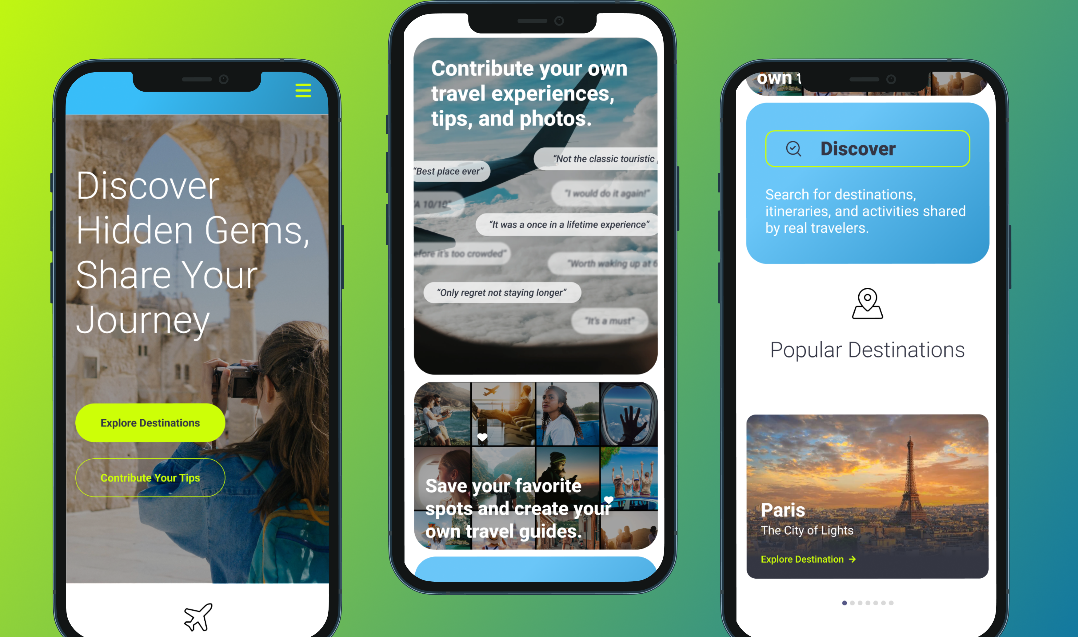
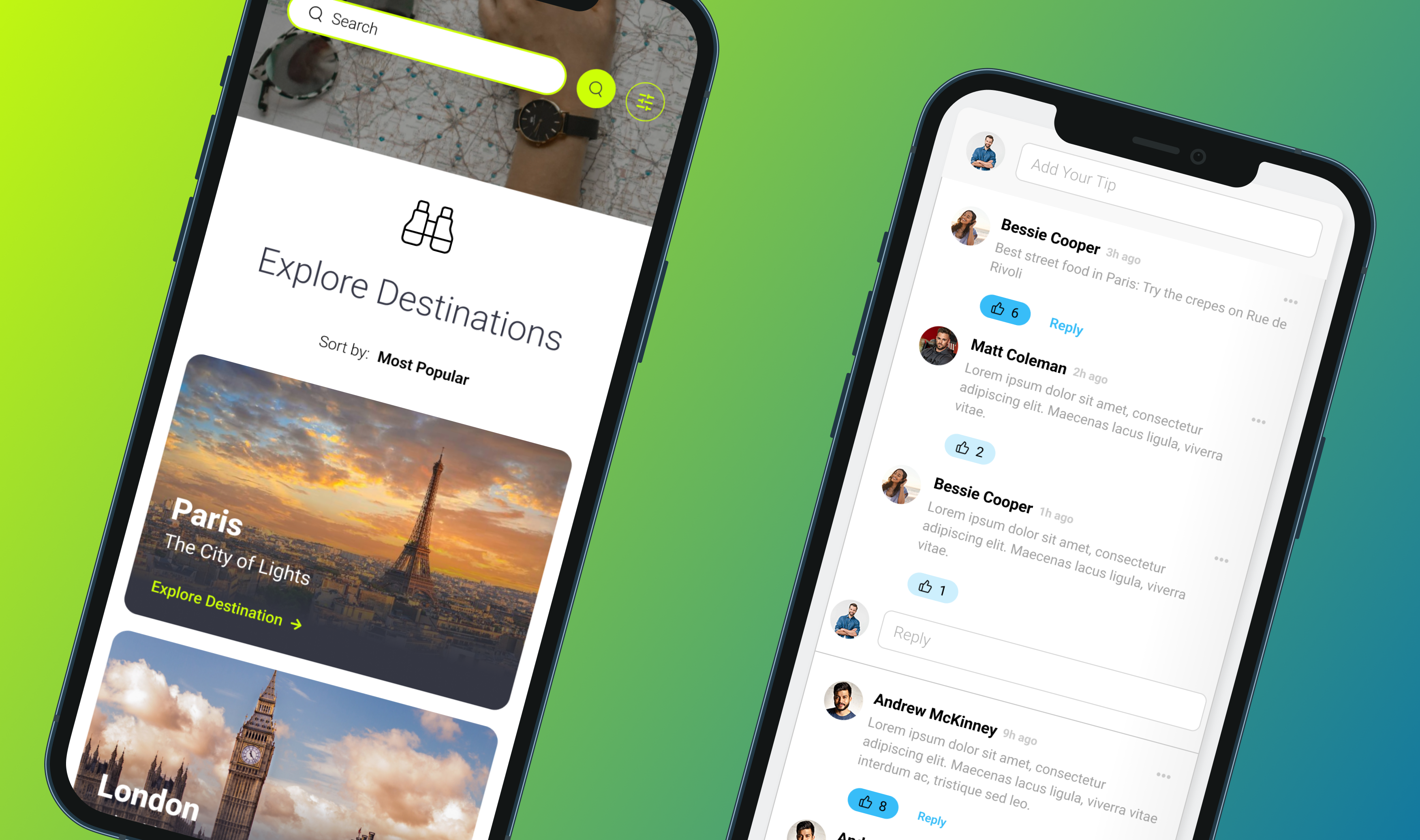
We used a minimalist design approach, focusing on content and easy navigation. The homepage featured personalized recommendations, while users could filter and contribute their own experiences to the platform.
The Result & Learning
The platform attracted a dedicated user base, with engagement increasing by 50% after launch. We learned the importance of balancing personalized content with community-driven contributions, and how fostering a sense of belonging can drive user retention.
